New in ParaView: Settings UI

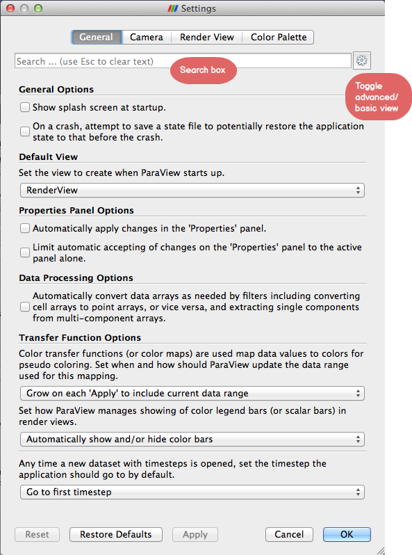
One of the few things that has remained unchanged in the ParaView UI since 3.0 was released is the settings dialog: a dialog born from the days when serious applications needed to have lots of complicated settings. Not any more! Soon to land in ParaView’s development repository is a brand new way to set application preferences.


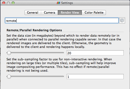
The dialog consists of searchable tabs that allow you to search for parameters by name or description as well as scan through available options for both basic and advanced users. If the pattern looks similar to the Properties panel or Color Map Editor panel, that’s because the dialog indeed uses the same underpinnings as those with a minor twist to show descriptive text for parameters rather than a terse label.
The implementation provides flexibility, extensibility, as well as customizability for custom applications and plugins alike. Also site mainters can now deploy ParaView instances with default settings for their choice. More on that in a follow up post coming soon(ish).
Definitely informative :), however I feel that the UI panel is a bit “busy” or “crowded”. I prefer simple looking, and use secondary UI components to display information/help if users are interested. Things like an “Information” icon, next to each editor widget to show the detailed version of description, and the label just shows a brief version of description, or maybe use tooltips for long version. The search box will help here, but it may be better if users don’t even need to search :). I kind of feel “lost” with all the information.
Generally speaking, yes, that’d make sense. But for application settings, in most cases just a label is never sufficient. Most users (besides the honed ones) need to refer to the “extra information” to understand what that setting does e.g. “Unstructured Grid Outline Threshold” was a setting we had previously; what in the world does that do? Even I could never remember, and always have to refer to the tooltip. Just putting the descriptive text there takes that extra step out.
Note, custom applications and plugins can still show panels with just the traditional labels/tooltips. It’s all done by putting a XML “hint” when defining the proxy for the settings collection.
First I want to say these settings panels are looking much better than the existing ones. Much more friendly and I like that each widget has a description rather than a terse label.
Next some (hopefully constructive) criticism.
Why are the settings separated by tabs at the top? The trend in the properties panel and color map editor are to instead list all properties vertically with horizontal separators in the list. This was to alleviate the problem of having to click through tabs trying to find things. The settings panel for Google Chrome, which was one of the inspirations for this change, also similarly lists all things vertically rather than try to separate them in tabs.
Also, I suggest being much more selective in the non-advanced settings. Do most users really need an option to suppress the splash screen? I suggest limiting the non-advanced settings to a very small number (maybe 7) that will fit on one screen. Going through the current settings in 4.1.0, here is the list that I would suggest: Auto Apply, Auto Convert Properties, Choose Color Palette, Select preset for client/server parameters. Everything else should have good defaults that most users will not need to modify.
Ken,
That was the original proposal indeed, but if I remember correctly, in our meeting to discuss the same, we concluded that having them in separate “pages” as they are right now was better since otherwise we ended up with a very long page.
Separate tabs also make it a little easier to group things like “Color Palettes” and “Camera” separately.
We could easily change it, however.
Your suggestion for keeping the non-advanced list short indeed makes sense. Once this lands, we can iterate over it as needed to pick good defaults and keep the non-advanced view compact.