New Default Colormap and Background in the next version of ParaView
The next version of ParaView will feature two very noticeable changes: the default colormap and background will be different! This marks the first change in these defaults in well over a decade. In this blog post, we will describe why the change was made and explain why the new defaults are better for most visualization tasks.
Motivation
Over many years, the most common request we have heard from our scientist and visualization collaborators was to be able to see more detail within their data. Detail is produced by increasing the color contrast between the individual hues that span the colormap. It is a tricky problem because one needs to maximize the internal contrast levels while maintaining smooth visual transitions. The contrast provides feature resolution while the smoothness minimizes abrupt hue changes within the colormap that, if present, could falsely indicate abrupt changes in the data.
The existing Cool to Warm default colormap serves a wide range of data well, especially data rendered in three-dimensional form. The light range of the colormap enables one to see shading that is a key factor in 3D shape perception. However, because the darker range of hues were removed, the discriminatory power of the colormap has been greatly reduced. In the new default, we have balanced the need to see 3D forms with the competing need for feature resolution.
New Colormap Development
Global contrast across a colormap is maximized by following the longest visually logical line through a color space. However, a few factors complicate the issue: perceptually uniform color spaces do not completely represent human color perception; colors interact with surrounding colors which can impact the smoothness and discriminatory power between hues; hues varying in dominance (saturated red will draw more attention than a light gray, for example) can therefore create unequal attentiveness across the colormap.
The new default colormap in ParaView, dubbed Fast, provides a notable improvement over its predecessor, Cool to Warm. Both colormaps use a similar color scheme, with blue for lows and red for highs, so use of Fast should be familiar. But Fast provides multiple improvements including more discriminability that provides a higher resolution of the numbers in the range to be perceived. It also provides more color hues that add vibrancy to the colors and more distinction from neutral backgrounds. Figures 1 and 2 compare the old and new default color maps in ParaView applied to different datasets.
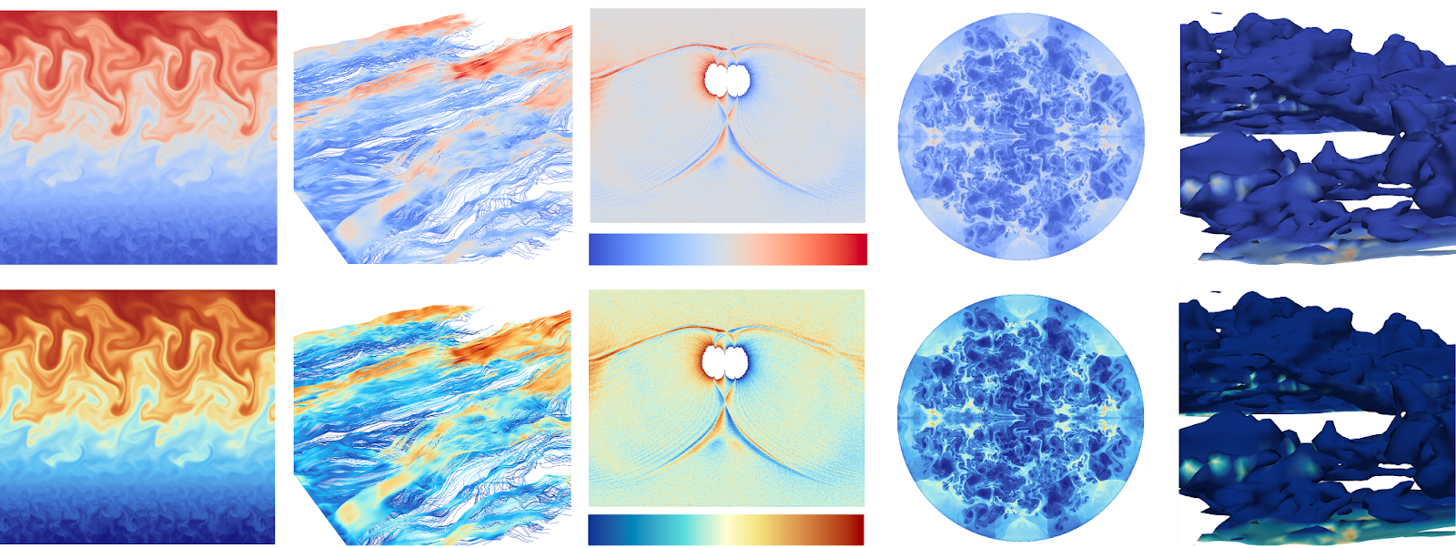
Figure 1: From left to right there are five datasets: ocean kinetic energy, wildfire wind, magnetic reconnection, combustion simulation, and wildfire smoke. Each exhibits different data characteristics to show how ParaView’s previous (top) and new (bottom) default color maps compare when the data covers the full color map range, when the data features noise, and when the data is concentrated in the low end of the data range [1].
The application of the three different default color maps that have been available in ParaView over its history to another dataset is shown in Figure 3. The Fast colormap improves upon the discriminatory power of the Cool to Warm color map which in turn was an improvement from the Hue Wheel colormap in the earliest versions of ParaView.
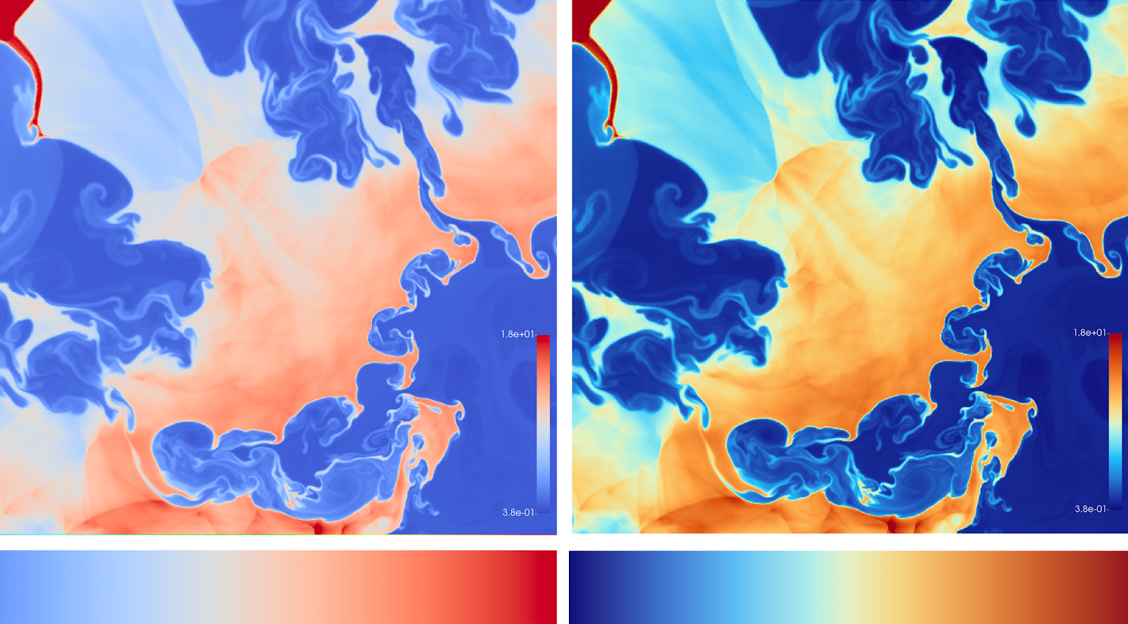
Figure 2: Comparison of ParaView’s old (left) and new (right) default color maps. Cool to Warm (left) has been ParaView’s default color map for many years. The new color map, Fast (right), further enhances feature discrimination, as demonstrated on combustion data. This progression reflects improvements in visualizing data from sources like “Blast: High-order finite element hydrodynamics” https://computing.llnl.gov/projects/blast, 2020 [1].
New Background Development
In addition to improving the default colormap in ParaView, we developed an improved default background color. Background color selection has a significantly larger impact on a visualization’s legibility than one might expect. Our goal was to identify a background hue that most commonly placed the focus across the full range of the data optimizing one’s ability to explore the data regardless of the colormap selection.

Figure 3. This is one of numerous tests comparing colormaps against various backgrounds. The top image uses the old default background, the middle one features a dark warm gray, and the bottom one a light warm gray.
Basic color theory tells us that value, the range from light to dark, is the most potent type of contrast followed by warm/cool contrast, meaning red to yellow and green through blue to violet, respectively. The original default background color in ParaView was a dark blue gray. This was chosen to enable contrast between background and data when a standard gray scale was applied to data. What we found over several years of comparing results was that the level of blue saturation in the background interfered with one’s ability to read detailed features in data rendered in cool colors. While not much of an issue when you have one solid form, it was clearly an issue with point data and renderings where one sees the background through the data.
In order to address the issue we looked at both cool and warm grays spanning a range of values. We tested them using a wide range of data types and colormaps. Warm grays tend to produce less interference with the data regardless of whether the data rendered was primarily warm, cool or a mix of both hue ranges. As expected, the value of the background had a significant impact on clarity, varying by the primary value ranges within the rendered data. To address the need we have included two gray background options in the default drop down background menu. We recommend the lighter gray for visualizations rendering primarily in dark and saturated hues and the darker gray background if key data is rendered in primarily lighter hues.
Like colormaps, no one background color is optimal for all visualizations. Publications often require white backgrounds. Cosmology data is often rendered with a black background, mimicking the blackness of space. However, to maintain focus equally across the full range data, the warm grays, in most cases, outperformed other options. We recommend testing out the dark and light gray options to see what best suits your data. The new default is the light Warm Gray background available in ParaView 5.13.0.
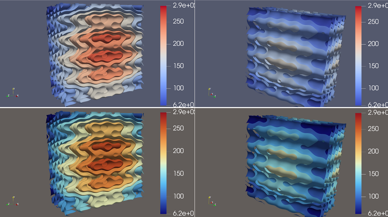
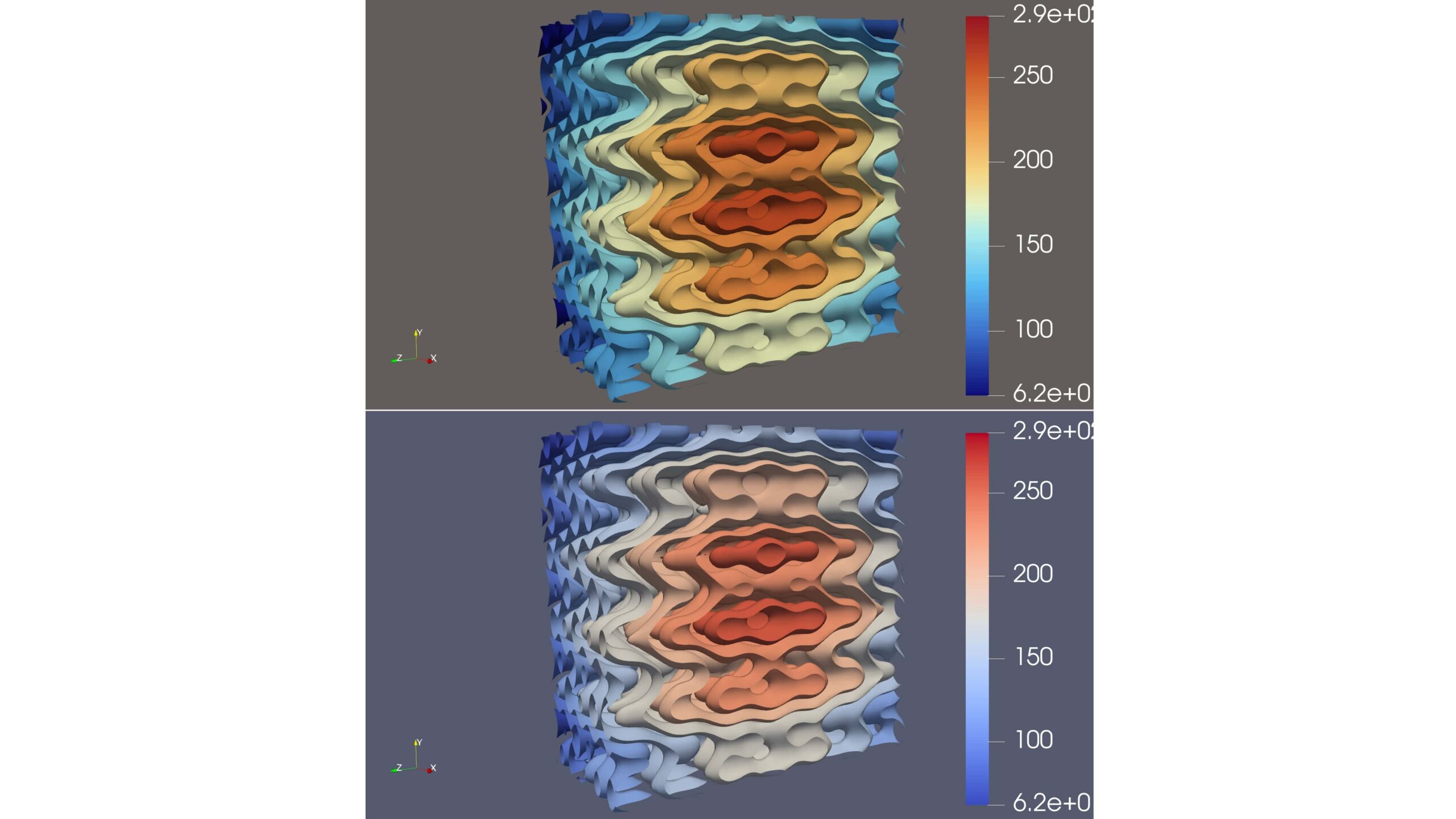
Figure 4: (Top) The former default Cool to Warm colormap coupled with the Blue Gray background [1]. (Bottom) The newly default Fast colormap paired with the Warm Gray background.
References
Publication: [1] F. Samsel, W.A. Scott, K. Moreland, A New Default Colormap for ParaView, in IEEE Computer Graphics and Applications, vol. 44, no. 04, pp. 150-160, 2024. doi: 10.1109/MCG.2024.3383137
Discourse post with community discussion about the change: [2] Replacement default color map and background palette
Acknowledgements
Authorship of this article was funded by Sandia National Laboratories.
Sandia National Laboratories is a multimission laboratory managed and operated by National Technology and Engineering Solutions of Sandia, LLC., a wholly owned subsidiary of Honeywell International, Inc., for the U.S. Department of Energy’s National Nuclear Security Administration under contract DE-NA0003525.
SAND2024-13531O
Why use a diverging map as the default?
We chose a diverging map as a compromise between monotonic maps and maximal color maps. Monotonic maps have an unambiguous low/high semantic, but tend to have low discriminability. Features often get washed out. Maximal color maps insert as many possible colors to make small changes the most noticeable, but they can make larger features harder to see. The diverging map doubles the discrimination of a monotonic map while still having a natural low/high semantic with careful color choices. That makes it a reasonable choice for many applications.
One criticism of our use of diverging color maps for the default is that the middle point is often neither special nor necessarily the neutral value as is generally suggested by a diverging map. Se try to compensate for that by smoothing out the middle values to make the transition more subtle. On a more anecdotal note, I personally like how the diverging map quickly indicates low, medium, and high values of the range, which I find helps even when the middle values are not special.