Introducing the New ParaView Colormap Preset Dialog


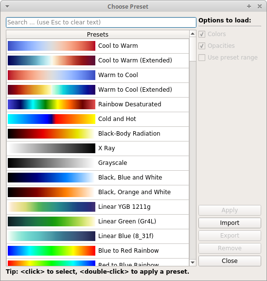
ParaView comes with a collection of predefined color maps used to map data values to colors in a visualization. The collection has grown ever larger over the years with 188 color maps. The ParaView color map preset dialog in ParaView 5.5 simply showed the list of presets available in no particular order. However, in this list there was no information about which color maps are recommended for use, and the list was extremely long. While you could search for a color map by name, this assumed you already knew what you were looking for. Furthermore, the dialog did not allow interaction with the main ParaView window while it was active. For these reasons the color map preset dialog was due for an overhaul.

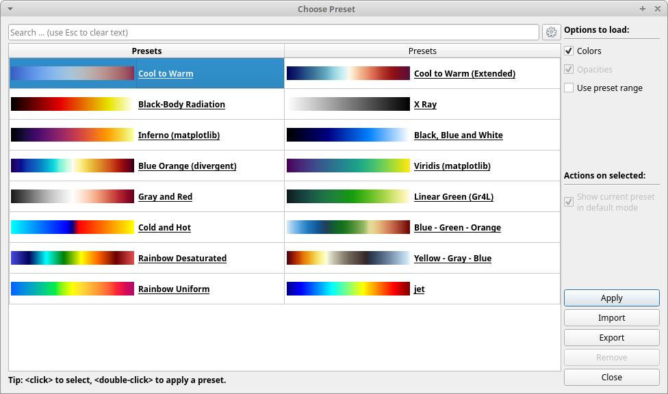
Coming in ParaView 5.6, the new dialog defaults to a subset of “good” colormap presets that were chosen after a long discussion with visualization experts. It shows the presets in two columns to allow more colormaps to be displayed at once (and so all the recommended defaults fit on screen at once). Additionally, interacting with the render view of the main window is now possible. You can zoom, pan, rotate the camera, etc. while the colormap preset dialog is up. The rest of the ParaView UI will remain unresponsive though: only the render view will be interactive.

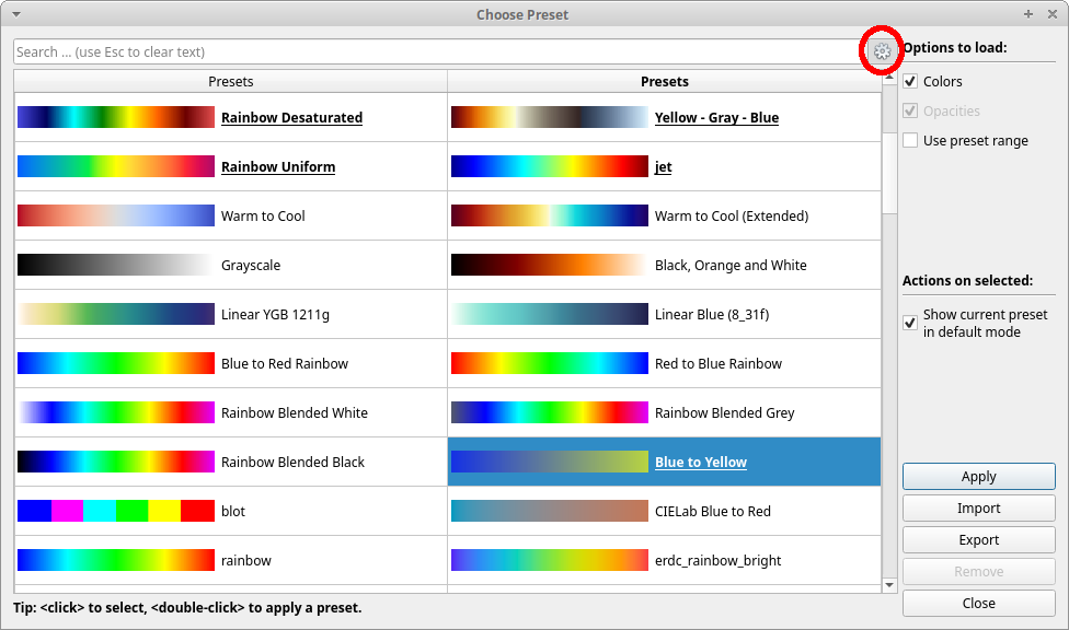
When the advanced button (circled in Figure 3) is toggled, the new colormap presets dialog will show the full list of presets similar to the old dialog. When a non-default preset is selected the “Show current preset in default mode” checkbox on the right becomes active. If you check this box then that preset will be shown even when advanced mode is off. This will allow you to set your own commonly used presets as defaults which will show up without having to open the full list.
The new dialog will be available in the ParaView 5.6 release.
Acknowledgements
The work was funded by Sandia National Laboratories.
Sandia National Laboratories is a multimission laboratory managed and operated by National Technology and Engineering Solutions of Sandia, LLC., a wholly owned subsidiary of Honeywell International, Inc., for the U.S. Department of Energy’s National Nuclear Security Administration under contract DE-NA0003525.
We give special thanks to the visualization experts who formulated the list of default color maps:
Francesca Samsel, Center for Agile Technology, University of Texas at Austin
Terry Turton, Los Alamos National Laboratory
Roxana Bujack, Data Science at Scale Team, Los Alamos National Laboratory
John Patchett, Los Alamos National Laboratory
James Ahrens, Los Alamos National Laboratory
Colin Ware, Center for Coastal and Ocean Mapping, University of New Hampshire
W. Alan Scott, Sandia National Laboratories
Ken Moreland, Sandia National Laboratories
hello, in a preview 5.4.1 tutorial document P50, it mentions to stay away from selecting rainbow band of color maps. So, why is a rainbow color map added as default in bold letters in paraview 5.6? Can you please explain?
Asif,
I’ve more than once been told to ‘please use a rainbow color scheme’ because the customer is comfortable with it, regardless of the fact that color-blind people on the team have difficulty viewing the results. I actually work with a color blind person who prefers a rainbow scale with a specific range because he’s learned how to work with results in that scheme.
Plus, if you’re comparing your visualization with results from another tool, everybody is likely to be able to speak in rainbow.
Asif,
Several variants of the rainbow color map that are better than the classic rainbow are provided in the defaults, but note that the classic rainbow is not a default. The reasons David O gave are precisely why the classic rainbow color map remains a selection in ParaView. We can advise people not to use it, but we still need to provide it as it is the color map of choice for many practitioners so they can satisfy the requirements of the clients for whom a visualization is created.