Color legend improvements coming to ParaView 5.4
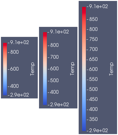
Pseudo-coloring of surfaces and volumes is one of ParaView’s primary methods of displaying data. ParaView’s color legend provides an important link between color and data values, and is a critical component of many visualizations. Over the years, ParaView’s color legend features have expanded to cover numerous usage scenarios, including annotating specific values with text, showing the color assigned to NaN values, showing categorical colors, and controlling different elements of the color legend such as font size and style.
The color legend’s versatility unfortunately came with a somewhat complex implementation. The previous implementation made it challenging to debug when problems arose and difficult to augment when new features were needed. For ParaView 5.4, we have added a new color legend implementation that resolves a number of existing bugs and paves the way to make adding features easier in the future.
The new color legend has some key differences from its older counterpart.
Nicer automatic labels
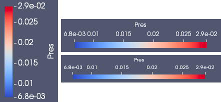
One of the complaints with the previous color legend involved the numbers chosen for labels. These numbers were chosen by subdividing the numeric range assigned to the color legend into evenly spaced intervals. Not infrequently, seemingly odd choices of scalar values that required a large number of decimal places would be chosen for labels. In the new color legend we use the same algorithm used by ParaView’s 2D charts to compute “nice” label values that have a more compact representation based on multiples of 2, 5 or 10.
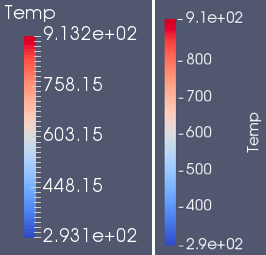
You will also notice that the title placement has changed for vertically oriented color legends. Instead of having a horizontal orientation that can potentially use up a lot of horizontal and vertical space, the title is rotated to be vertically aligned with the length of the color legend.
Another key difference with labels in the new color legend is that the number of labels is determined automatically by how many nice numbers fit within the span of the long dimension of the legend. In the prior implementation, one could specify a maximum number of labels, but this property was really just a suggestion that did not always work out in a satisfactory way. Note that if you are not satisfied with the automatic labels in the new color legend, you can exercise total control of the labeled values with the feature described in the next section.

Label with specific values
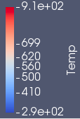
A new feature in the color legend enables one to specify the exact labels displayed by the color legend. When enabled, the automatically computed label values will be replaced with the requested labels. This gives total control over the label values that are displayed.
Out-of-range colors are now displayed
The Above Range and Below Range colors can be assigned to all values that fall either above or below the numeric range assigned to the color legend. Colors for these values were not displayed in the color legend in the previous version. They are presented in the new version as color swatches at either end of the color bar. The NaN color swatch remains available in the new color legend.

Improved annotation layout
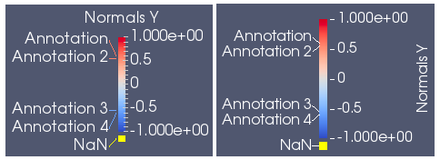
The new color legend continues to support annotations that are useful for labeling special values with arbitrary text. There were certain configurations where the annotation text was laid out in unexpected ways in the old color legend; the new legend improves on the layout.
More precise font control
In the previous color legend, the displayed font size was indirectly related to the specified font size. The size of the color legend affected the scaling of the requested font size which often lead to a disconnect between the font size that was requested and the font size that was displayed on the screen. The new color legend respects the requested font size regardless of the size of the color legend.
More precise color bar thickness control
Like font size, the thickness of the color bar (the smaller dimension) was controlled by an aspect ratio that related the length and thickness of the scalar bar. The thickness would change size if the scalar bar length was changed. In the new color legend, the color bar thickness is specified in terms of points, much like how font sizes are specified. Some examples below show the relation between scalar bar thickness and font size.
Setting color legend position
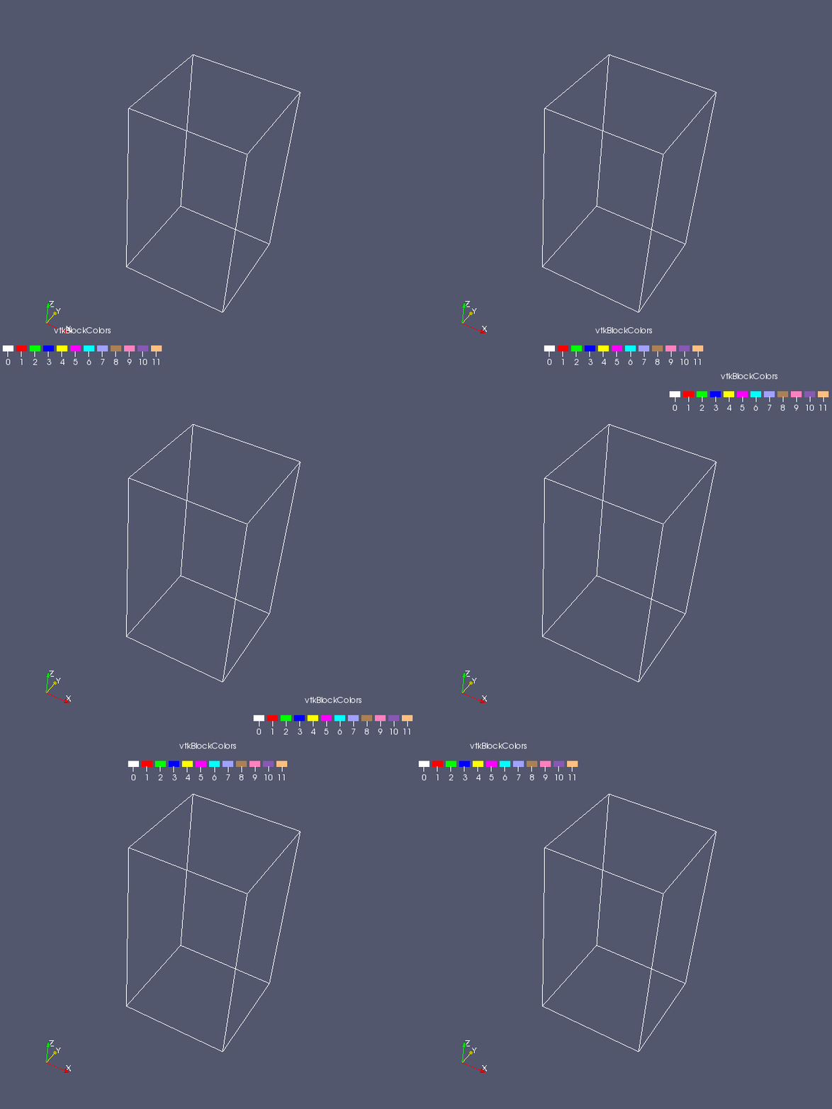
While the new color legend supports interactive dragging to position it in any location on the screen, a new Window Location property lets you specify one of six predefined window locations: Lower Left Corner, Lower Right Corner, Lower Center, Upper Left Corner, Upper Right Corner, and Upper Center. When one of these window locations is chosen, the color legend will stay anchored to it such that all parts of the color legend are guaranteed to be visible. A seventh option, Any Location, enables the color legend to be dragged to any position on the screen. This option is automatically set when interaction with the color legend occurs.
Backwards compatibility
Though the presentation of the new color legend has changed, most of the existing color legend properties have been preserved. Two exceptions are:
- AspectRatio – controls the thickness of the color bar
- Point2 – which controls the length of the color legend
Backwards compatibility handling for Python scripts written in earlier versions of ParaView will ensure that these properties continue to work as expected in ParaView 5.4.
Conclusion
We hope you enjoy using the new color legend coming to ParaView 5.4.0. Please let us know if you have any problems using it and how we might improve backwards compatibility with existing ParaView state files and Python scripts.
Can the default color map be changed from diverging to sequential (ideally, one that is perceptually uniform)? I would assert that usually sequential color maps are what are required by users.
Even in the last example of pressure given above, a sequential color map is more logical than the default diverging blue-white-red one. The value of 0.0175 has no significance and should not be assigned the “middle” (white) color. Instead, the color map should ramp smoothly from the minimum value to the maximum. Only when the data represents deviation about a middle value (e.g., distance away from zero or unity) does a diverging color map make sense.
See additional discussion at: https://matplotlib.org/users/colormaps.html.
Thank you for considering this request.
Joel,
Let me first sidestep your question by pointing out that you can specify a different color map default in ParaView. In the Color Map Editor, choose your preferred color map. Next, scroll down to the very bottom. There are a few tool buttons there. If you click the tool button with the folder icon and downward-facing green arrow (without the horizontal axis), this will save the current color map as the default for all data arrays going forward.
Now, for your question. Here is a ParaView wiki page detailing the thought process leading to the current default “Cool to Warm” color map: http://www.paraview.org/ParaView3/index.php/Default_Color_Map
Thanks for the quick reply and attention to this.
Indeed, I do change my default to something I prefer. My concern is for those users who just “use what they are given” with little thought given to why the default is provided and whether it makes the most sense for the data being presented.
Thanks for the link to the Wiki. I had no doubt that serious thought went into the color choices, and I’m glad to see them laid out.
Some more thoughts below in my reply to Kenneth to address some additional thoughts on the discussion and his added points.
In addition to Cory’s comments, which are correct, I just want to reiterate that we gave a lot of thought to the current default color map. The cool/warm color map is not perfect (no color map is), but we considered many alternatives (including sequential) and many design constraints.
Your points are valid, Joel, and I don’t want to dismiss them. Nor do I want to get into a religious war over “right” and “wrong” color maps. (We can agree that we are both right.) I will, however, take some to discuss our rational.
Sequential color maps are great for providing a natural ordering by creating a monotonic increase (or decrease) in luminace. This same property, however, limits the perceptual resolution of the map. This is especially problematic for maps used on 3D surfaces where you need to keep the luminance high enough throughout to make surface shading visible. We chose the diverging color map because you can double the perceptual resolution by making the luminance go from low to high and back to low. To maintain a “natural” ordering of colors we chose endpoint colors that clearly invoke cool and warm for low and high values. Furthermore, because we realized that there may be nothing particularly significant about the middle value, we chose a completely neutral white that is neither low nor high. To reinforce the neutral-ness of the middle, there is a smooth arc in the plot of the luminance rather than a sharp point. This mutes the transition and removes the mach band that can form with sharp luminance transitions.
You are welcome to disagree with our rational and to propose suggestions for new color maps. Such a change to ParaView would require a lot of discussion and buy-in from the ParaView user and developer community. A direct comparison between the cool/warm and the proposed new map, including, I think, targeted perceptual studies, would be required to demonstrate a new color map as being the clear winner. In the mean time as Cory suggested you can locally change your ParaView install to use whatever color map you find best as default.
Thanks for the reply and additional thoughts. I’m extremely happy to see such deep thought went into the choice (though I didn’t suspect it was arbitrary). I have some follow-up points and a proposal to take any additional discussion offline (I see you linked through to your email, and maybe we can include Cory?). Let me know if this makes sense and I’ll forward my contact information to continue things.
1) I’m happy you and Cory are willing to participate in such open-minded discussions to ensure that ParaView represents the best that can be developed for visualization. With that, I agree that we are “both right” and that there is no perfect color map. As developers, you certainly have much better exposure to users to determine which color map is the most sensible default for the most common applications. I have only my own experience (which I also don’t want to include a religious war).
2) I agree that blue-white-red provides maximum luminance for 3D surfaces and can also think of no other superior color map. This is a fair point and needs to weigh into the color maps usefulness as a default. Note that I resist calling blue-white-red cool/warm because white seems neglected; anything intuitively linked to temperature should be something like the black body map as far as I’m concerned. 😉
3) I realize I suffer from some cognitive bias because of how I’ve always considered/applied sequential/diverging color maps. With that, *I* assign significance to that central albeit white value because *I* think of it as representing some nominal value that one is interested in determining distance away from (e.g., for ratios or positivity/negativity). I also assign significance to the distance away from that central value based on the intensity of the color (and thus feel it should be used with equidistant bounds, e.g., -1 -> 0 -> 1). My concern stems mainly from the feeling that others might have similar intuition as they interpret data.
4) To your concluding point, it would be outstanding if such a study could take place. There are certainly several high quality sequential and diverging maps in ParaView and elsewhere, and hopefully some day such a study could take place. In the meantime, perhaps more user education into these types of nuances and color map advocacy would assuage my worry.
The bottom line is that I’m concerned users use defaults with little consideration for the effect on how the data is interpreted as a result (including by colorblind readers and on B&W printed material). Because there are so many “right” answers, how is the “best” one selected? That’s the question I wonder if we can answer.
Perhaps you have thoughts on how best to get the message out (a) to not blindly use defaults but rather consider the color map for each data set and (b) on what to consider when making that judgement? Ideally, this will always take place. If not, then the default must be the least damaging to the most common use cases. I leave it to the developer’s aggregate experience to determine what that is, and it may be blue-white-red.
Again, thanks for the good discussion. I look forward to seeing how ParaView continues to change and improve. Please let me know if you’d like to discuss further.
Nice feature!
I always wondered: What’s the reasoning behind having legend bounds in another print format (scientific) than in-between values ?
I’ve always wondered about this as well. Please, do tell!
The range endpoints do not in general land on multiples of the “nice” labeling convention used on the rest of the axis, hence a different format is needed to sufficiently represent the range values. The particular format was from a specific customer request. Note that the format can be changed in the Color Legend properties, and they can be turned off altogether.
Thanks for the improvements. I really like the new automatic labelling and the displaying of out-of-range colours.
I was a bit confused by the new tick marks though. With the intermediates removed, all the remaining marks look like negative sings to me.
Roland,
Thanks for your comments. Regarding the new tick marks looking like negative signs, others have had the same comment (not in the blog comments). I’ll fix it before the final 5.4 release.
The tick marks have been improved for the vertical orientation to disambiguate them from negative signs.
I am sorry if this is not an appropriate place to post this, but with v5.4, whenever I export a scene in for example, eps or pdf format, the color legend is automatically placed in the left bottom corner, even though I had placed somewhere else. It is fine for png or jpg though. Can this be fixed somehow?
Thanks for the report, Aziz. I’ve filed an issue with your report here: https://gitlab.kitware.com/paraview/paraview/issues/17639
Hi,
Thanks for the imroved colour legends in Paraview 5.4!
Just a quick question: for some particular plots I am creating, I would ideally like the colour bar vertical and the text horizontal (like the old behaviour in these respects but with the nicer labels etc.), but I cannot seem to be able to achieve this. The “Orientation” option only allows the bar and text to be set together. Is this possible and I’m not seeing it?
Thanks!
That feature will be available in ParaView 5.5, due out sometime in November, 2017. The new property is named “Horizontal Title” under the “Edit Color Legend Properties” – check that box to make the horizontal title.
If you can’t wait for the release, the feature is currently available in the nightly builds on http://www.paraview.org/download. Change the Version popup menu to “Nightly” and grab a recent build suitable for your OS.
Thanks for the quick reply! I’ve tried the latest nightly built with the UI I could find (which seems to be in the 5.4.0 series) and “Horizontal Title” feature works great. Looking forward to seeing this in 5.5!
Hello,
I’m looking for putting a legend on two lines because it is too long. Do you have a solution for that ?
I’m using Paraview 5.0 with a script. I would be glad if you have a command line solution.
Thank you in advance.
I’m not entirely sure what you mean by “it is too long”. It is possible to shrink the horizontally-aligned color legend by adjusting the color legend properties. You can do something like the following:
lut = GetColorTransferFunction(‘DataArrayName’)
view = GetActiveView()
sb = GetScalarBar(lut, view)
sb.Position2 = [0.5, 0.12]
Splitting the legend somehow into two lines is not possible, however.
ParaView remains ignorant about units. It treats data as raw numbers and leaves the interpretation of what those numbers mean to users. To add units to a legend, you would need to manually edit the color legend title to indicate the units to the viewer.
Because ParaView is ignorant of units, there are no conversions available. You can use the Calculator filter to do most conversions. Python Calculator would also work, as would Programmable Filter, though the first two are simpler to use and cover most use cases.
Hello, I wish to know how to utilize the feature level with specific values. Please let us know how to set levels of the highest and lowest range with the specific values in our picturization of our results.
You can assign minimum and maximum data values using the custom range dialog as described in the ParaView Reference Manual located here: https://docs.paraview.org/en/latest/ReferenceManual/colorMapping.html#transfer-function-editor
If you have further questions about ParaView usage, please post them to discourse.paraview.org.